Category: Unit 1

  • Methods of Contextualising: Written Responses

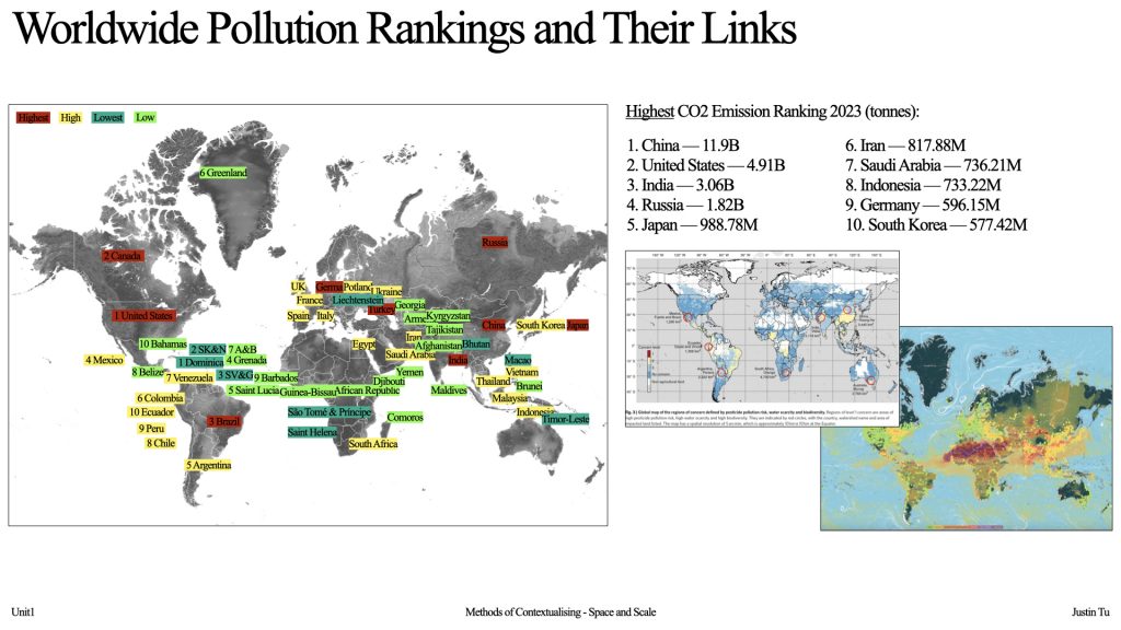
    Through reviewing environmental datasets and references with my group, I realised climate justice is not only negotiated through policy but also through everyday consumption systems that designers actively shape. Although climate discourse has been prominent for over a decade, I recognised that I had internalised it as distant and overwhelming rather than actionable. This project shifted my perspective as a practitioner: instead of imagining change as large-scale and inaccessible, I began to focus on designing small, implementable systems that influence daily behaviour.

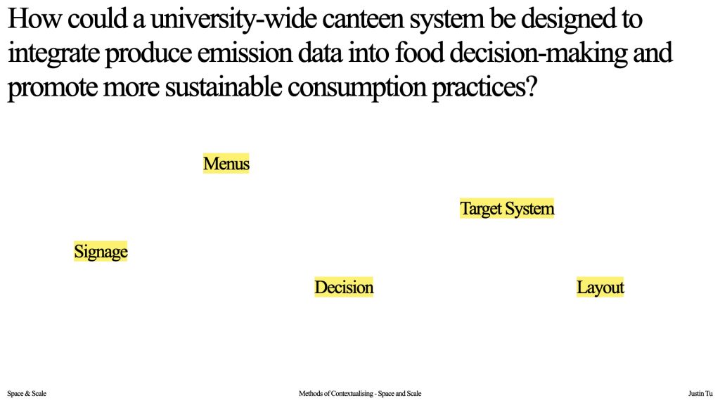
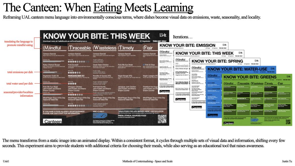
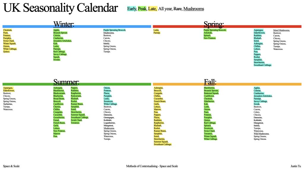
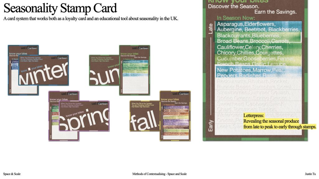
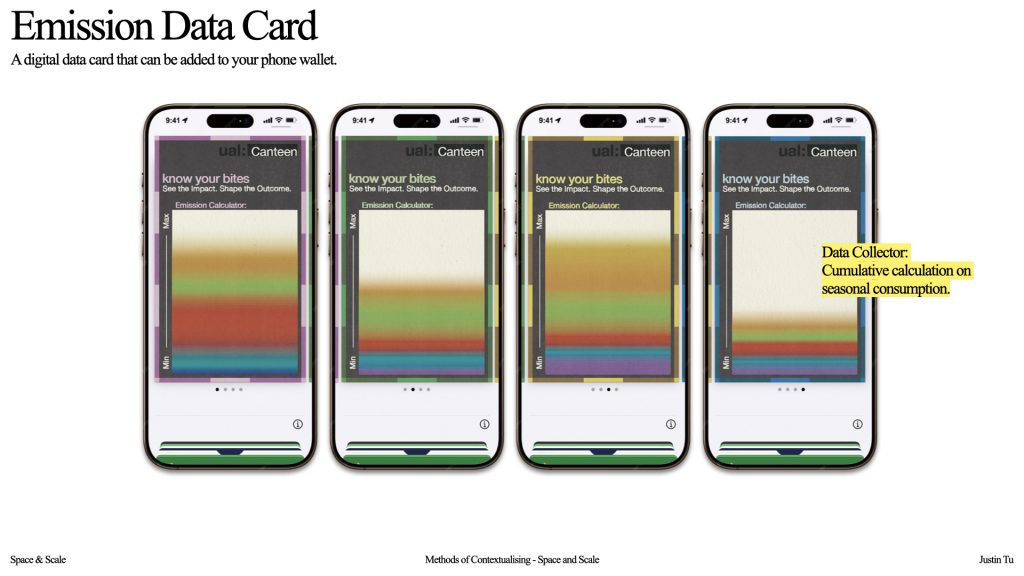
    I consequently reconsidered graphic design not as a one-directional act of raising awareness, but as a framework for structuring participation. We applied this approach by developing a canteen system in which each stage, choosing, purchasing, eating, and disposing operates as a learning interface. The proposal supports institutional sustainability goals by embedding guidance directly into user experience rather than presenting information separately. By prioritising seasonal, high-quality produce, it aims to reduce energy demand and food waste while encouraging responsible consumption.

    This process reframed my role from communicator to facilitator, positioning my practice within climate justice as one that enables agency, accessibility, and collective accountability.

    Bibliography

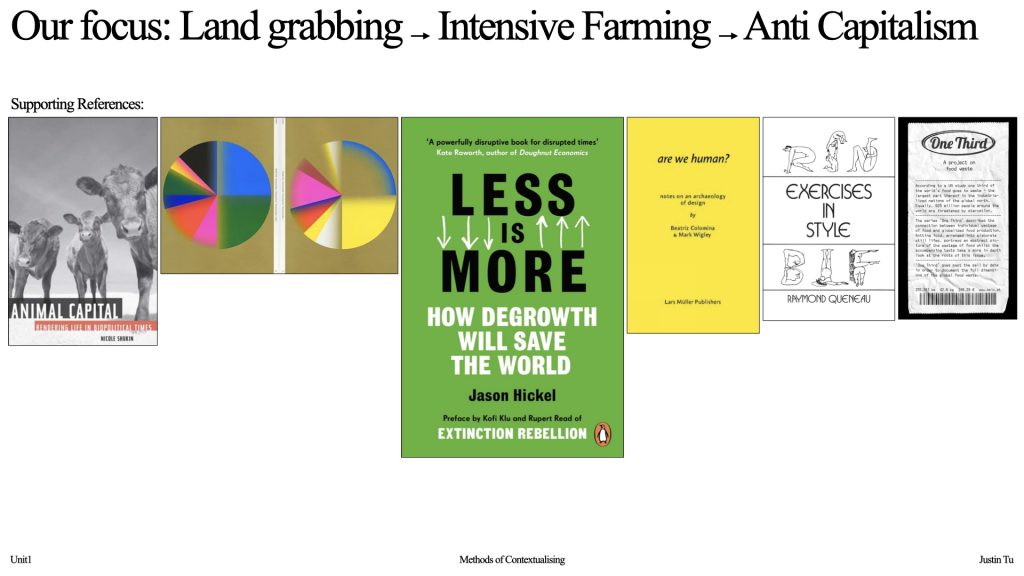
    1. Jason Hickel (2020) Less Is More: How Degrowth Will Save the World. London: William Heinemann.

    This text examines Enlightenment philosophy, particularly the ideas of Descartes and Bacon, as foundational to a hierarchical worldview that separates humanity from nature and legitimizes extraction. By tracing how colonial power classified racialized subjects as closer to “nature,” the author reveals epistemological links between ecological exploitation and social domination. 

    This framework clarifies how contemporary capitalist economies continue to organize resource use through asymmetrical power relations. It also reshaped our understanding of the food system: rather than interpreting intensive agriculture as a technical or policy failure, we began to see it as an extension of a longer intellectual history that normalizes control over land and bodies. Because the text operates at a macro-historical scale, we were required to translate its claims into situated design strategies. This tension led us to foreground seasonal, local plant-based consumption not as lifestyle advice, but as a design intervention that challenges extractive logic within everyday practice.

    2. Nicole Shukin (2009) Animal Capital: Rendering Life in Biopolitical Times. Minneapolis: University of Minnesota Press.

    In Animal Capital, Nicole Shukin theorizes how animal life functions simultaneously as material resource and symbolic currency within capitalist systems, a dual process she terms “rendering.” This concept was pivotal to our enquiry because it reframed industrial food production not simply as agriculture but as a representational economy in which animal bodies circulate as signs, commodities, and surplus value. Rather than treating meat production as an ethical issue alone, Shukin’s analysis situates it within biopolitical regimes that manage life itself as extractable capital. 

    This shifted our project away from a narrow sustainability framework toward examining how visual culture, branding, and consumer narratives normalize extraction.Particularly influential was her claim that capitalist systems depend on representational strategies that obscure the violence and material costs of extraction. Recognizing this mechanism directly informed our design methodology: instead of presenting food as a finished dish, we visualize the emissions and resource data embedded within it. In this way, our project adopts Shukin’s critical framework as a visual strategy, transforming concealed infrastructures into perceptible information and repositioning design as a tool for rendering hidden systems legible.

    3. Beatriz Colomina and Mark Wigley (2016) Are We Human? Notes on an Archaeology of Design. Zürich: Lars Müller Publishers. – from reading list

    In Are We Human? Notes on an Archaeology of Design, Beatriz Colomina and Mark Wigley argue that design does not merely surround human life but actively produces it, positioning humans themselves as outcomes of designed systems. This claim reframed our understanding of design from a communicative tool into an evolutionary force that structures perception, behaviour, and knowledge. Rather than seeing our project as simply visualizing environmental data, we began to interpret it as participating in the ongoing construction of how ecological reality is understood. 

    The authors’ assertion that we are “suspended in design” was particularly generative, prompting us to consider how informational formats shape what counts as visible or actionable knowledge. While their argument operates at a broad philosophical scale, translating it into our project required grounding it in specific visual decisions. This led us to treat data not as neutral content but as a co-authorial agent, where the act of redesigning information becomes a reciprocal process through which both viewer and dataset are reconfigured.

    4. Hezin O (2018) ‘Gaji #9: Paper and Offset Print’. Interview with It’s Nice That. Available at: itsnicethat.com (Accessed: 20 February 2026).

    The interview published by It’s Nice That on Hezin O emphasizes process as the source of meaning rather than a neutral production step. Discussing her work with silkscreen and Risograph printing, she highlights how visible dot structures reveal that gradients are optical constructions rather than seamless images. This attention to pre-image systems, grids, units, angles, and line densities reframed our understanding of visual language as something built from rule-based frameworks rather than expressive surfaces. Her calendar project was particularly influential because it translates numerical time into a visual syntax generated entirely through printing logic, demonstrating how information can be structured through material constraints. 

    This methodological approach directly informed our own strategy for visualizing hierarchical data: instead of illustrating information descriptively, we began constructing it through systematic visual grammars that make structure perceptible. While the article functions primarily as a practitioner interview rather than theoretical text, its emphasis on procedural thinking provides a practical model for how design methods themselves can encode meaning, positioning technique as an epistemological tool rather than a neutral medium.

    5. Queneau, R. (1998) Exercises in Style. London: John Calder. – from reading list

    In Exercises in Style, Raymond Queneau systematically retells a single ordinary event in dozens of stylistic variations, transforming linguistic constraint into an experimental method for testing how form alters meaning. Rather than treating language as a neutral vehicle for content, the work demonstrates that structure, tone, and format actively produce interpretation. This procedural logic was particularly influential for our project, which approaches data visualization as a series of formal experiments rather than a single optimized solution. By repeatedly redesigning the same informational content through different textual and graphic systems, we began to assess how shifts in representation affect legibility, authority, and pedagogical impact. 

    Queneau’s method encouraged us to treat variation not as decoration but as research, using iterative translation to probe the limits of comprehension. While his work operates within literary language, adapting this approach to visual communication required us to extend stylistic experimentation into diagrammatic and informational forms, positioning design iteration itself as an investigative tool.

    6. Klaus Pichler (2012) One Third. Ostfildern: Hatje Cantz.

    In One Third, Klaus Pichler stages discarded food in the visual language of classical still-life photography and pairs each image with statistical information about global food waste. By juxtaposing aesthetic seduction with quantitative evidence, the work demonstrates how representation can shift from passive depiction to critical disclosure, revealing the infrastructural realities embedded within everyday consumption. This strategy was particularly influential for our project because it models how data can function as a perceptual intervention rather than supplementary information. Instead of treating environmental statistics as explanatory captions, we began to integrate them directly into the visual system of each dish, allowing emissions data to actively reshape interpretation at the moment of viewing. 

    Pichler’s approach suggests that when information is encountered simultaneously with the object it describes, it has the potential to alter judgment and choice. While his work operates within a photographic and exhibition context, translating this logic into a design framework prompted us to consider how informational visibility might influence real-time decision-making, positioning data visualization as a behavioural catalyst rather than a descriptive layer.

  • Methods of Contextualising

    As we are working on the theme of “Space & Scale”, we wanted to first actually understand how the impacts of climate change are felt both locally and globally, so we started by gathering pollutions information from around the world. We pulled together the informations we found on different platforms including air quality rankings, water pollution rankings, and most importantly emissions data and started mapping.

    When you look at this you can tell countries that were historically colonisers tend to appear cleaner, while many formerly colonised regions show heavier pollution. It’s not a random distribution, and it raises questions about how those historical power structures still shape environmental conditions today.

    Our Primary Reference: Less is More
    This text traces how Enlightenment thought established a hierarchy separating humans from nature, legitimizing extraction and colonial power. It reframed our view of intensive agriculture not as a policy flaw, but as part of a longer history linking land control, capitalism, and domination.

    We then decided to focus on anti capitalism and intensive farming, exploring ways we can reduce overall waste and raise awareness about what we buy and eat. And this is where our project “know your bites” began, which explores the emissions of different foods and their environmental impact within UAL.

    This led us to focus on the university canteen system. When we started researching about the food served across UAL canteens, we found out that they had already done such a great job — the system is quite sustainable and mindful of its environmental footprint. However, we noticed that very few students are aware of this, or of the environmental impact of the food they choose to eat.

    We identified two types of care when it comes to environmental issues: ethical caring and in-practice caring. Ethical caring describes students who care about the issue in principle but don’t actively engage in ways that create change. In-practice caring, on the other hand, refers to students who take action, they educate themselves, make conscious choices, and have a tangible impact. 

    But we need them both.

    This insight led us to ask: how can we make sustainable action feel easy and accessible in everyday life? Specifically,

    With that question in mind, we began developing a system that not only informs people about the impact of the food they eat, but also actively engages them, making sustainability something they can participate in, rather than just think about.

    We estimated carbon footprint for each dish that we calculated. To calculate the emission of each dish we used the food carbon footprint calculator developed by « My emissions » a carbon reporting platform that works with brand to reduce their food carbon footprint. While calculating these data we put the different food into broader categories to create a system that would be easy to understand visually while still being impactful. 

    And to encourage students to move into in-practice caring, we wanted to make sustainable choices feel intuitive and approachable. We approached this by encouraging people to think about eating seasonally and buying locally.

    We began by mapping out UK produce across the year, organising it to show when items are early, peak, or late in their season.

    To make this information engaging rather than instructional, we introduced an element of playfulness through a card system that works both as a loyalty card and an educational tool about seasonality.

    Each meal earns you a stamp, and after ten meals you receive a reward, along with access to the seasonal information hidden on the card. The card is valid for one season, after which you receive a new one that reflects the next cycle of produce.

    The card contains information about seasonal produce which are embossed into the paper, in the order from late to early. The catch is that to read it, you have to reveal it with ink. And to get that ink, you need to eat in the canteen.


    Building on this idea, we also designed a digital version of the card that can be added to your phone wallet. Each time you eat, you scan your meal, and its carbon footprint is added to a gradient bar. Each colour represents a different emissions category like our menu, turning it into a visual record of your personal food footprint, like a constant, gentle reminder of your impact.


    With this system implemented across the canteen, we hope to support students in transitioning from ethical caring to in-practice caring, not just caring in principle but caring through everyday decisions. Ultimately, we hope this doesn’t just stay within the canteen. We want students to gain knowledge they can take home, share with others, and apply in their daily lives.

  • Methods of Iterating: Written Responses

    [Draft1]

    Through copying and analysing motion-based works in After Effects, I began to reconsider my previous understanding of time in relation to making. In the past, I associated time primarily with labour: the longer I spent on a work, the more refined it could become. However, working with animation software shifted this perception. Time no longer functioned only as a measure of production, but as an active compositional structure within the work itself.

    Compared to my previous understanding of two-dimensional composition, constructed through points, lines and planes, After Effects introduces time as an additional dimension through which spatial depth is produced, rather than modelled. A single change at one moment in time can transform the entire trajectory of the image. This raises critical questions: how can time operate as a material within composition rather than merely a duration of making? In what ways does temporal control reshape ideas of space and visual rhythm?

    To explore these questions, I propose a studio-based experiment in which I animate the same set of graphic elements under different temporal conditions. By keeping spatial composition constant while altering timing, easing and sequencing, I aim to observe how time alone restructures narrative and spatial depth. This experiment will allow me to explore time as an active paintbrush, shaping the composition through duration rather than spatial arrangement.

    [Draft2]

    After an initial stage of experimentation with After Effects, I became interested in how keyframes govern the majority of actions within the software, and how the intervals I set between them perform much of the work. This led me to reconsider the relationship between time and visual form: Could it operate as a compositional material that translates directly into the artwork? In response to this question, I began to experiment with “hacking” the Timeline Panel, treating it not as a back-end control interface but as a primary site of composition.

    However, through this process, it became clear that within After Effects’ operational logic, time itself cannot exist independently of spatial attributes. Keyframes can only regulate the speed or rhythm of transformation between predefined parameters; they cannot autonomously determine where an object moves from or to, nor what shape it becomes. This limitation clarified the role of time within the software: rather than replacing spatial composition, time functions as a relational compositional mechanism, responsible for organising the order, rhythm, and overlap of events.

    Against this backdrop, I began to use the Conditional Design Manifesto as a methodological lens through which to analyse and advance my enquiry (Maurer et al., 2013). The manifesto emphasises conditions over outcomes, systems over singular forms, and process as something that can be repeatedly executed while producing difference. Rather than attempting to make time directly determine spatial placement, I instead designed a set of experimental conditions that allowed time to intervene in the organisation of graphic relationships.

    By keeping the temporal structure consistent while allowing spatial parameters such as scale and position to vary, the same time-based conditions generated multiple visual outcomes. Spatial relationships adapted in response to a fixed temporal framework. In this system, time does not replace spatial composition, but operates as a structuring constraint that governs how spatial elements relate to one another.

    By adopting Conditional Design as a methodological framework and working within the constraints of After Effects, the focus shifts from producing a fixed visual result to designing conditions that allow differences to emerge. Rather than resolving the question of time as a compositional material, this process positions graphic communication as something that can unfold, adapt, and remain contingent, existing not as a final image, but as a system negotiating the relationship between time, structure, and visual form.

    Reference:
    • Maurer, L., Puckey, J., Wouters, R. and Paulus, E. (2013) Conditional Design Manifesto. Amsterdam: Conditional Design.

    [Draft3]

    This reading is structured in layers, allowing the text to be accessed at different levels of depth. The full text presents the complete conceptual argument, while selected excerpts distil its core ideas into shorter versions for quicker engagement.

    Reference:
    • Kubler, G. (1962) The Shape of Time: Remarks on the History of Things. New Haven: Yale University Press.

  • Methods of Iterating: Presentations

    Introduction

    I have long been drawn to abstract visualisers, from the iTunes and PlayStation visualisers I watched as a child to contemporary loopy animations that create atmosphere rather than narrative. There was something hypnotic in simply watching forms respond over time. To begin this project, I decided to remake an animation that provides a visual presence to linger with the viewer.

    week1

    From this starting point, the artwork I chose to replicate is this animation by Julia Schimautz, whose work focuses on animation incorporated with Riso printing techniques. It creates a warm feeling and texture that gives a nostalgic touch.

    I started analysing the artwork and trying to understand how she creates her work. At first, I thought it was created by making a few graphic elements and naively assumed that After Effects would do all the magic and create all the in-between transitions. But that was not the case.

    After doing more research on her process, I realised that she first designs the animation, then exports it into frames and prints them through Riso. This creates the unique Riso effect, and then the frames are brought back into After Effects or Photoshop to make a stop-motion animation.

    After understanding this process, and by following the brief, I decided to try replicating the artwork using one program throughout. This is where my own process began.

    In my first attempt, I created an animated bar using a masking method, where the reveal of colour depended on how the mask opened and closed. I then duplicated this bar into 11 of them and rescaled it. After this, I applied effects to simulate a Riso texture. However, with this approach I could not control the starting point of the gradient, and after adding the halftone effect the colour disappeared completely.

    In the second attempt, I used a different method to construct the bars. I created a central block and expanded it outward, adding the gradient directly onto each block. I then tested an alternative way of simulating the Riso effect, which allowed the colour to remain visible. During this attempt, I noticed that each bar was moving at a slightly different speed, rather than only changing in colour. At this point, I decided to let this problem remain unresolved and return to it in the next iteration. Despite this improvement, I still struggled to achieve the desired gradient and texture.

    In the third attempt, I revised both the gradient construction and the expansion method. More importantly, I introduced more additional stop points to better control the movement, allowing each bar to have slightly different starting and ending points. This resolved many of the motion issues. However, the Riso effect continued to disrupt the preset, causing a loss of detail in both the gradients and textures.

    In terms of movement, I feel I am gradually approaching the intended rhythm and overall motion of the artwork. However, replicating the Riso texture digitally remains challenging.

    Through copying and analysing motion-based works in After Effects, I began to rethink how I understand time in making. Before, I mainly saw time as labour — the longer I spent on a work, the more refined it became. Working with animation changed this. Time is no longer only a measure of production, but becomes an active compositional element.

    Compared to my previous understanding of two-dimensional composition, constructed through points, lines and planes, I realised that After Effects introduces time as an additional dimension. Small changes at a single moment can reshape the entire movement of an image. This led me to ask:

    How time can function as a compositional material, rather than simply a duration of making?

    week2

    Building on what I mentioned last week, while exploring After Effects I realised that it introduces time as an additional dimension. Small changes at a single moment can reshape the entire movement of an image. When time became an active part of the composition, I began to question how it could be deliberately shaped and structured, rather than simply experienced as duration.

    With this in mind, I began to consider what could be played with within the software itself.

    1. This led me to the idea of hacking the Timeline Panel, where keyframes are usually organised and used to control duration.
    2. How? Instead of treating the Timeline Panel as a purely functional control, I began to think of it as a canvas. If the timeline itself becomes the site of creation, what kind of artwork does that produce, and what does it mean?


    The graphic I drew into the panel was the word “LOVE” — a bit cheesy, I know. I used a grid to map the points where the letters intersected, then translated those points into the timeline so they could drive the animation from the back end.

    Through this process, I realised that in After Effects, time cannot exist on its own; it always relies on spatial information. While keyframes can control rhythm and speed, they cannot determine where something moves or what form it takes. This clarified the role of time for me: rather than replacing spatial composition, time organises relationships such as order, rhythm, and overlap.

    I began the project with a more whimsical enquiry: whether time could be treated as a compositional material in itself, shaped in the same way as form, colour, or space. However, experimentation made it clear that time cannot function independently unless embedded within a rule-based or preprogrammed system.

    Returning to the readings, I turned to the Conditional Design Manifesto to push the project forward. This shift redirected my focus away from fixed outcomes and towards systems and conditions. Rather than forcing time to determine spatial form, I began setting up conditions in which time could intervene more indirectly.

    From this position, I began testing how time could affect composition by constraining the ways elements interact with one another. Instead of determining spatial form directly, time operates at the level of conditions, shaping when and how compositional relations can occur. Composition is no longer a stable visual state, but a temporally negotiated condition.

    Time cannot be a compositional material, but it can function as a compositional authority…

    In these further iterative experiments, visible differences in motion and rhythm emerged; however, time was present only in prompting elements to react to one another and had not yet fully exerted control over compositional possibility.

    week3

    This led to a second approach: rather than allowing time to organise change, I began using time to deny compositional completion altogether. If composition is understood not as an image, but as a set of conditions that allow elements to coexist simultaneously, then time’s intervention is not to create variation, but to restrict simultaneity.

    When time governs the conditions of visibility, composition shifts from spatial arrangement to temporal negotiation…

    Under this framework, different elements appear at different moments—sometimes overlapping, sometimes delayed—but at no point are they present together. As a result, the composition cannot be held as a complete whole; it only exists as fragments distributed across time.

    In developing this approach, I was drawn to broader reflections on how time is structured and understood. In The Shape of Time, George Kubler challenges linear, biologically modelled narratives of history, proposing that time operates through relational sequences rather than continuous progression(Kubler, 1962). This framework reinforced the idea that time actively structures the emergence and disappearance of form, rather than merely containing it.

    This perspective also resonates with certain Eastern philosophical understandings of time, which emphasise cyclicality, intuition, and momentary awareness rather than linear accumulation. The Chinese phrase “花開花落自有時 huā kāi huā luò zì yǒu shí” (flowers bloom and fall in their own time) encapsulates this view: time is not a consumable resource, but a recurring condition through which existence unfolds.

    This idea informed the visual poster developed from the experiments, where composition is never fixed, never fully revealed, and always contingent on temporal flow.

    Moving forward, I’m interested in how this approach to composition, where elements are fragmented across time and never fully co-present, could open up further possibilities beyond formal exploration. By distributing composition rather than resolving it, the work creates space for meaning to emerge through absence and delay. I’m curious how this method could be extended to contexts where visibility is restricted, and where what cannot be shown becomes as significant as what appears.

  • Methods of Translating: Written Response

    In this study, I employed the “double entry” narrative structure from Exercises in Style (Queneau, 1998) to reframe Georges Perec’s Rough draft of a letter from Species of Spaces and Other Pieces (Perec, 1997). Through this process, I examined how shifts in linguistic texture reshape the reader’s sense of rhythm, tone, and emotional immediacy within the text.

    4. Or else:
    Rough draft of a letter

    Original

    I think of you, often
    sometimes I go back into a cafe, I sit near the door, I order a coffee
    I arrange my packet of cigarettes, a box of matches, a writing pad,
    my felt-pen on the fake marble table
    I spend a long time stirring my cup of coffee with the teaspoon
    (yet I don’t put any sugar in my coffee, I drink it allowing the
    sugar to melt in my mouth, like the people of the North, like the
    Russians and Poles when they drink tea)
    I pretend to be preoccupied, to be reflecting, as if I had a decision
    to make
    At the top and to the right of the sheet of paper, I inscribe the
    date, sometimes the place, sometimes the time, I pretend to be
    writing a letter
    I write slowly, very slowly, as slowly as I can, I trace, I draw each
    letter, each accent, I check the punctuation marks
    I stare attentively at a small notice, the price-list for ice-creams,
    at a piece of ironwork, a blind, the hexagonal yellow ashtray (in
    actual fact, it’s an equilateral triangle, in the cutoff corners of
    which semi-circular dents have been made where cigarettes can
    be rested)
    Outside there’s a bit of sunlight
    the café is nearly empty
    two renovators’ men are having a rum at the bar, the owner is
    dozing behind his till, the waitress is cleaning the coffee machine
    I am thinking of you
    you are walking in your street, it’s wintertime, you’ve turned up
    your foxfur collar, you’re smiling, and remote…

    Double Entry:

    I often think and remind of you. 
    I happened to be seated and to sit down in a café, close and adjacent to the entrance door and portal.
    I ordered and requested a coffee beverage, and, having done so, I arranged and placed before me upon the marble-patterned tabletop a pack of cigarettes and tobacco, a box and container of matches, a notepad and writing pad, and a felt-tipped pen and instrument for writing and journaling.
    For a long and extended time I stirred and revolved my teaspoon and utensil in the cup and the mug, despite no sugar and saccharine element had been placed or inserted therein.
    I sipped and consumed my coffee in the manner and custom of northern peoples and inhabitants, permitting the sugar to melt and dissolve upon the tongue and in the mouth.
    I appeared and pretended to be occupied and preoccupied, to reflect and to deliberate, as though there were a weighty and serious decision and resolution to be made and taken.
    At the upper right-hand corner of my page and sheet, I wrote down and traced the date and time, sometimes also the place and location, as though and as if composing and writing a letter.
    I wrote slowly, deliberately, and at a measured pace, forming and drawing each letter, sign, and accent, verifying and checking each punctuation mark.
    I contemplated and observed attentively the menu and price-list for the desserts and ice-creams, a piece of ironwork and grille, a blind and shutter, and a yellow ashtray of equilateral triangular form, its corners truncated and cut away to make semicircular indentations for resting cigarettes.
    Outside, some sunlight and brightness could be seen and perceived.
    The café was and appeared nearly empty and devoid of customers and patrons.
    Two workmen and renovators at the counter consumed and drank rum; the owner and master of the café nodded and slumbered behind the till and cash register; the waitress and servant cleaned and polished the coffee machine and apparatus.
    All this while I was and found myself thinking and reflecting upon you.
    You were walking in your street and along your block; it was wintertime, the Christmas season. You had turned up your foxfur collar, smiling, distant and remote…

    The experiment revealed that style does not simply convey feeling but constructs it, turning Perec’s intimate letter into something self-conscious, performative, and faintly absurd.

    Reference
    • Perec, G. (1997) Species of Spaces and Other Pieces. London: Penguin Books Ltd.
    • Queneau, R. (1998) Exercises in Style. London: John Calder.

  • Methods of Translating: Final Presentation

    Something I found interesting is that there’s a research showing sex does not sell within the younger generation, but when we look at the advertisement now many of them are still selling sex. if it’s not working anymore, why are they still doing it?

    The question led me to explore the imagery used in lipstick marketing, where visual strategies often rely on sexualized symbolism. So i begin to ask myself


    Maybe by doing that, I can expose the mechanisms of desire that culture has built around it.

    Experimenting with Different Methods of Translation

    1. By paraphrasing and extrapolating, I translated an image into a database inventory sheet.  With informations like IDs/ Colour names/ Pigment Compositions.…etc.

    2.By hybridising and mimicking, I translated one image into another. Using metaphor to invite viewers to see the face as a site of endless projection and editing, and the colours as their material origins rather than seductive names, testing whether desire and perception are already pre-coded.

    3.By relaying and improvising, I translated a visual image into sound.


    These experiments allowed me to reimagine what it might look like when there’s nothing left for us to perceive in a sexual way.

    Functional Substitutes: The Cosmetic Display Reimagined

    Moving forward, I wanted to push this idea further. I created a functional display system to reimagine what it would look like if these lipstick images were replaced by scientific or neutral substitutes in real store settings.

    I’m not sure how people would feel encountering this in a beauty shop. Personally, I’d think, oh, that’s cool, very scientific and professional. But at the same time, I might feel even more objectified.

    There’s less fun, less spontaneity, less room for creativity or imagination. I feel like a chemical compound waiting to be experimented on…

    When Sex is Stripped Away

    Returning to the initial question: what remains when the sexual element is stripped away? Does it still have value? Do people still desire to colour their lips if it wasn’t about being seen, or performing for someone else’s gaze?

    Pro Agency. Not Anti-Sex.

    I know not everyone wants to be desired, but it’s also okay to want to be desired.

    So, what should we expect from the future of cosmetic marketing? Can advertisements strike that sweet balance — creating something empowering, while resisting objectification? I think these are the questions we need to keep in mind when we think about what it means to sell beauty today.

    Maybe instead of creating “anti-sex” commercials, we first need to understand this:
    Sex does sell, but it should sell when the idea of agency is at its core.

  • Methods of Cataloguing: Written Response

    Introduction
    I have chosen to analyse a part of the introduction of Living a Feminist Life by Sara Ahmed (2017), specifically the section titled “A Feminist Movement.” Ahmed writes: “We are moved to become feminists. I think of feminist action as like ripples in water, a small wave, possibly created by agitation from weather; here, there, each movement making another possible, another ripple, outward, reaching.” The opening line defines feminism not as a fixed belief system, but as a response of feeling: a state of being moved. In emphasising emotion as something triggered through different forms of action and inseparable from politics, Ahmed positions feeling as the very motor of the feminist movement.

    Analysis
    To explore how these emotions, triggered through various forms of action, develop and extend into other dimensions of feminist practice, I began to catalogue the text by creating a list that identifies and organises the different kinds of movement Ahmed describes. This process allowed me to see how emotion, within her writing, shifts fluidly between the personal, the collective, the intellectual, and the reflective.

    CategoryOriginal ContentInterpretation
    Being moved“We are moved to become feminists.”“Perhaps we are moved by something: a sense of injustice, that something is wrong.”“A feminist movement might happen the moment a woman snaps, that moment when she does not take it anymore.”Ahmed locates the origin of feminism in an affective reaction: the bodily and emotional recognition that something is unjust. Being “moved” marks the beginning of political consciousness.
    Sharing Movement“A feminist movement is a collective political movement.”“Each movement making another possible, another ripple, outward, reaching.”“Feminism is bringing people into the room.”“We convene; we have a convention.”“Feminism needs to be everywhere because feminism is not everywhere.”Feminism grows through collective action and social connection. The metaphor of ripples illustrates how individual agitation transforms into shared energy and public gatherings.
    Naming Movement“I want to take here bell hooks’s definition of feminism as ‘the movement to end sexism, sexual exploitation and sexual oppression.’”“Intersectionality is a starting point, the point from which we must proceed if we are to offer an account of how power works.”“Feminism will be intersectional ‘or it will be bullshit.’”Naming defines and directs feminist politics. By citing theorists like bell hooks and Flavia Dzodan, Ahmed situates the movement within a lineage of thought, clarifying its aims and rejecting narrow or exclusionary forms.
    Sustaining Movement“A significant step for a feminist movement is to recognize what has not ended.”“We might think we have made that step only to realize we have to make it again.”“A feminist movement depends on our ability to keep insisting on something: the ongoing existence of the very things we wish to bring to an end.”“We acquire feminist tendencies, a willingness to keep going despite or even because of what we come up against.”To sustain movement means persistence and by recognising unfinished struggles and continuing despite fatigue or opposition. Feminism’s durability comes from repetition, insistence, and collective endurance.
    Questioning Movement“Much injustice can be and has been committed by those who think of themselves as the wrong sort… There is no guarantee that in struggling for justice we ourselves will be just.”“We have to hesitate, to temper the strength of our tendencies with doubt.”“A feminist movement that proceeds with too much confidence has cost us too much already.”Ahmed ends by reflecting on self-critique within feminism. Questioning movement prevents rigidity; it allows doubt, hesitation, and ethical reflection to coexist with conviction. Movement is sustained not only by action, but by reflection.

    Reflection and Conclusion
    By approaching the text through the lens of emotional movement, I began to see how feeling functions as both catalyst and structure within Ahmed’s writing. The act of being “moved” is not only personal but also collective, as emotions circulate, gather, and transform into political energy. Through the process of cataloguing, I observed how these movements of feeling expanded into other forms, including personal memories, social struggles, and linguistic shifts. Each operates like a ripple that connects the self to the collective, demonstrating how feminism is continually made and remade through lived experience. In this way, cataloguing became more than an analytical exercise; it became a practice of tracing connection, a small movement responding to Ahmed’s own.

    Reference
    Ahmed, S. (2017) Living a Feminist Life. Durham: Duke University Press.

  • Methods of Cataloguing: Final Presentation


    Catching the W/Rave

    Catching the W/Rave — a play on the words Wave and Rave — is the final project I created for Methods of Cataloguing. The work draws from Harvard’s digital collection Catching the Wave, reimagining and remixing its archive through a new lens. Here’s a glimpse at the 100 photos from the collection that inspired the project.

    My (re)definition of cataloging…  

    When talking about cataloging, my definition or (re)definition of it is to go beyond categorisation where it involves creating order and narrative, like curation, it’s about shaping connections and telling stories through how things are arranged.

    But while working on this set, I’ve been thinking how i can redefine perception without changing the story? Because when it comes to the history and the people who shaped it, we always have to approach it carefully.
    We can find new ways to see history, but we must respect its truth and the experiences it carries, otherwise, meaning can easily shift into misrepresentation or unintended humour.

    So i came up with these three topics by using different kind of methods:

    1. Catching the Wave – using the method of [(re)contextualizing]:
    Catalogued in dialogue with the presenter’s narration(generated), tracing the emotional shifts carried through each spoken line.

    Generated Speech:
    Serious: We stand here because equality is still treated like a privilege, not a birthright.
    Joyful: Yet look around—our colors, our laughter, our love—proof that even when the world tried to erase us, we painted it brighter.
    Angry: We are done being told to wait, to hide, to be “grateful” for crumbs of recognition.
    Sad: Too many names have been lost to violence, silence, and fear, carved into history when they should have been dancing beside us.
    Excited/hopeful: But today, we roar louder, prouder, knowing that change doesn’t whisper—it marches.
    Resolute: And until every one of us is free to live and love without fear, we will not sit down—we will not stop.


    2. Catching the Rave – using the method of [classifying]:
    Classifying the photographs by how close they resonate the energy and visual language of rave culture.

    It’s always interesting to think about the relationship between protesting and raving, as both are forms of resistance against systems of control. In many ways, they’re inseparable.
    Raving has always carried a spirit of protest — tracing back to the earliest underground gatherings, where those on the fringes of society came together to celebrate freely, without judgment.


    3: Catching the Babes –  using the method of [hijacking]:
    Hijacking the faces in the photographs to playfully honour both the known and unknown heroes.

    Focus on Catching the Rave…

    I found them all quite fun to play around with but i chose to focus on Catching the Rave. I created this photo book that brings together the work of Bettye and Freda with found images online from rave scenes, to explore the subtle connections between these two forms of collective expression.

    Note: The rave images included here haven’t been formally researched or verified — they’re used purely to convey the concept rather than as verified documentation at the moment.

    Photo book Intro
    This book reimagines their photographs within different rave settings, connecting past and present through shared energy and emotion. By placing these images in vibrant rave scenes, I wanted to reflect on how these gatherings began— and what they continue to represent today.

    Onward
    It works by cutting out spaces from rave scene photographs and filling them with fragments from protest images. I kept the original titles given by the photographers, mirroring their format when captioning the rave photos. The color of each page divides the book into two storylines, creating a visual and conceptual parallel between the two forms of expression.

    Ending
    Ending with the author’s words – which is me – As I worked on this project, I kept thinking about how much of what we have today was made possible by those who refused to stay silent. I hope these images remind us that every moment of joy carries a history of struggle, care, and hope, and that we keep reshaping what freedom means each time we come together.

    This is for those who fought so we could dance.

  • Methods of Investigating: Written Response

    My investigation, The Afterlife of Council Housing: Penshurst, explored whether or not the “Right to Buy” policy has transformed the social fabric of a housing estate once defined by collective ownership. Through photography, video, and recorded self-conversation, I aimed to understand if this shift from communal to private has reshaped the way residents inhabit and relate to shared spaces. Two readings from the course resonate with my work through different relationships of theme, form, and process: 

    i. In The Gleaners and I (2000), Agnès Varda begins her documentary as an investigation into the tradition of gleaning — collecting what is left behind after the harvest. Through this lens, she explores how the practice of gleaning has transformed in contemporary society: Who are the modern gleaners? What are their intentions, their meanings, their purposes? Along the way, Varda discovers that although people may be engaged in the same act, their backgrounds and motivations differ entirely. More than simply documenting, she becomes part of the inquiry herself.

    Similarly, my investigation adopted a process of observation and reflection. By photographing every door and categorising them into terms and assumptions, I sought to understand if the “Right to Buy” policy has altered the social dynamics of the estate. Like Varda, I found myself both documenting and participating: the act of photographing, naming, and questioning became a form of gleaning, gathering traces of what remains of communal life. Through this process, my position shifted from that of an observer to an inquirer situated within the narrative of transformation itself.

    ii. In The Neighborhood from Species of Spaces and Other Pieces (1974), Georges Perec provides a sense of place by observing the ordinary in meticulous detail. He describes everything that happens in the present moment, tracking down common things and outlining the contours of what usually go unnoticed with a light and humorous touch. Through this process of attention, Perec invites us to rediscover the familiar and to question what shapes our surroundings.

    Similarly, I approached the Penshurst estate through walking, recording voice notes, and transcribing self-conversations. By tracing the corridors, stairwells and areas I had never stepped into before, I attempted to capture the atmospheres and overlooked details of the site. Like Perec, I used description and reflection as a way to provoke questions: how does the doors, sounds, and routes construct a sense of belonging, and what do these small details reveal about the transformation from collective to private?

    Together, these two readings framed my investigation both thematically and methodologically. Varda’s exploration of what remains after social and material shifts paralleled my inquiry into the afterlife of council housing, while Perec’s attentive observation of the everyday informed my method of documentation and reflection.


    References:
    • Varda, A. (2000) The Gleaners and I. France: Ciné-Tamaris.
    • Perec, G. (1997) Species of Spaces and Other Pieces. Translated by J. Sturrock. London: Penguin Books.

  • Methods of Investigating: Final Presentation


    The Afterlife of Council Housing: Penshurst
    looking at the spaces left behind by policy and time


    what happened to these homes?

    Since October 3, 1980, the Right to Buy policy, introduced by Margaret Thatcher, has reshaped the UK’s housing landscape.
    I wonder what happens to a home when ownership changes hands — from the state to the individual, from the tenant to the landlord, from the collective to the market? 

    The Afterlife of Council Housing: Penshurst begins with a simple question: What happened to these homes?


    has the appearance of such communities shifted alongside the transformation of ownership structures?

    Rather than seeking a definitive answer, I’m trying to observe the traces of transformation left in the build environment. Through quiet documentation and comparative research, it reflects on whether the “Right to Buy” policy reshaped not only London’s housing stock but also its social fabric, its sense of belonging, and its architectural language.

    But what does that actually look like today?

    Come walk with me for a bit, let’s take a look around the council housing and see what we can find.

    so, i tried to see if the appearances matched the reality…

    As I went through the documentation, I expected to find a clear visual divide — privately owned homes showing more signs of personalisation or renovation, and council-managed ones appearing more standardised or worn.

    To test this assumption, I compared the visual categories with the ownership data through land and property information on HM Land Registry to see which homes are still council-managed and which are privately owned.

    And I found out that Penshurst is still mostly council-owned.

    The black blocks represent council-owned homes, while the other indicate privately owned ones. ( Council-owed:103 / Private-owned:27)


    And if we look at it by terms… (click to reveal the data)

    Clean.
    Maybe clean doors suggest stability, or simply a tenant or owner who puts time into upkeep? (Out of 55 doors, ___ are private)

    Out of 55, 11 are privately owned. But interestingly, at least half of those private ones aren’t what I’d call “clean.” So, maybe cleanliness isn’t about ownership at all. (11/55)


    Worn.
    Then there are the worn doors. Do they point to slow council repairs, or maybe a landlord who’s not so attentive? Or are they just old? (Out of 13 doors, ___ are private)

    Surprisingly, none of the worn doors are privately owned. (0/13)


    Decorated.
    I thought decoration would show individuality — someone claiming the home as their own. (Out of 4 doors, ___ are private)

    But, out of 4 decorated doors, none were privately owned. That surprised me. (0/4)


    Repainted.
    Fresh paint doors could mean care, or maybe just council maintenance. (Out of 38 doors, ___ are private)

    Out of 38 repainted doors, 7 are private. So… maybe the council’s actually doing a decent job? (7/38)


    Personalised.
    Some doors have small details like different knockers, stickers and personal touches. (Out of 32 doors, ___ are private)

    Out of 32, 9 are private. It feels like everyone, regardless of ownership, wants to leave a mark in some way. (9/32)


    Security-oriented.
    A few doors were heavy with locks, gates, or bars. Maybe that shows vulnerability, or maybe just caution? (Out of 11 doors, ___ are private)

    Only 2 out of 11 were privately owned, still, it makes you wonder what people are protecting themselves from. (2/11)


    Welcoming.
    Some doors just felt… welcoming, little signs of life, does that suggest a sense of warmth in the communal relationships? (Out of 22 doors, ___ are private)

    Out of 22, 6 are private. (6/22)


    Standardised.
    Does standardised doors show passivity, compliance, or simply indicate that the place is council-owned? (Out of 60 doors, ___ are private)

    Out of 60, 8 are private. (8/60)


    it turns out… the results weren’t what i expected.

    I thought the privately owned homes might look more cared for, more individual. But the patterns don’t quite fit. Some of the most maintained, even welcoming doors, still belong to council tenants and some private ones show signs of age, neglect, or uncertainty.

    Perhaps doors alone can’t tell the whole story but they do reveal quiet patterns of care,  neglect, and adaptation that hint at something larger.

    A policy once intended to empower disadvantaged groups and promote housing autonomy — has it, perhaps unintentionally, reshaped social hierarchies and created new forms of imbalance?

    As some former tenants become landlords and others renters, how might these structural changes affect the relationships and collective identity within the community? 

    • this project does not propose judgment. it asks, instead, whether or not the residue of policy can be seen in paint layers, in ornaments, in doors that both separate and connect us.